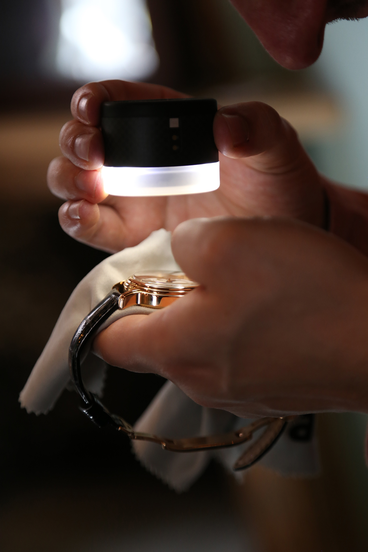
In the not too distant past, I was introduced to the world of high end loupes. Watch loupes of course. It was truly astonishing to see so many details on the dials & movements for the first time despite having looked at them before with less powerful loupes. Long story short, we’re looping you in (pun intended) on this visually enticing facet of horology with this brand new column #MacroMeister. In the column, we skip the macrology and head straight for the visuals with macro photography.
Special note: I encourage macro enthusiasts to get in touch if you want to get your shots featured, as the more MacroMeisters, the better!
Speedmaster 311.30.42.30.01.005
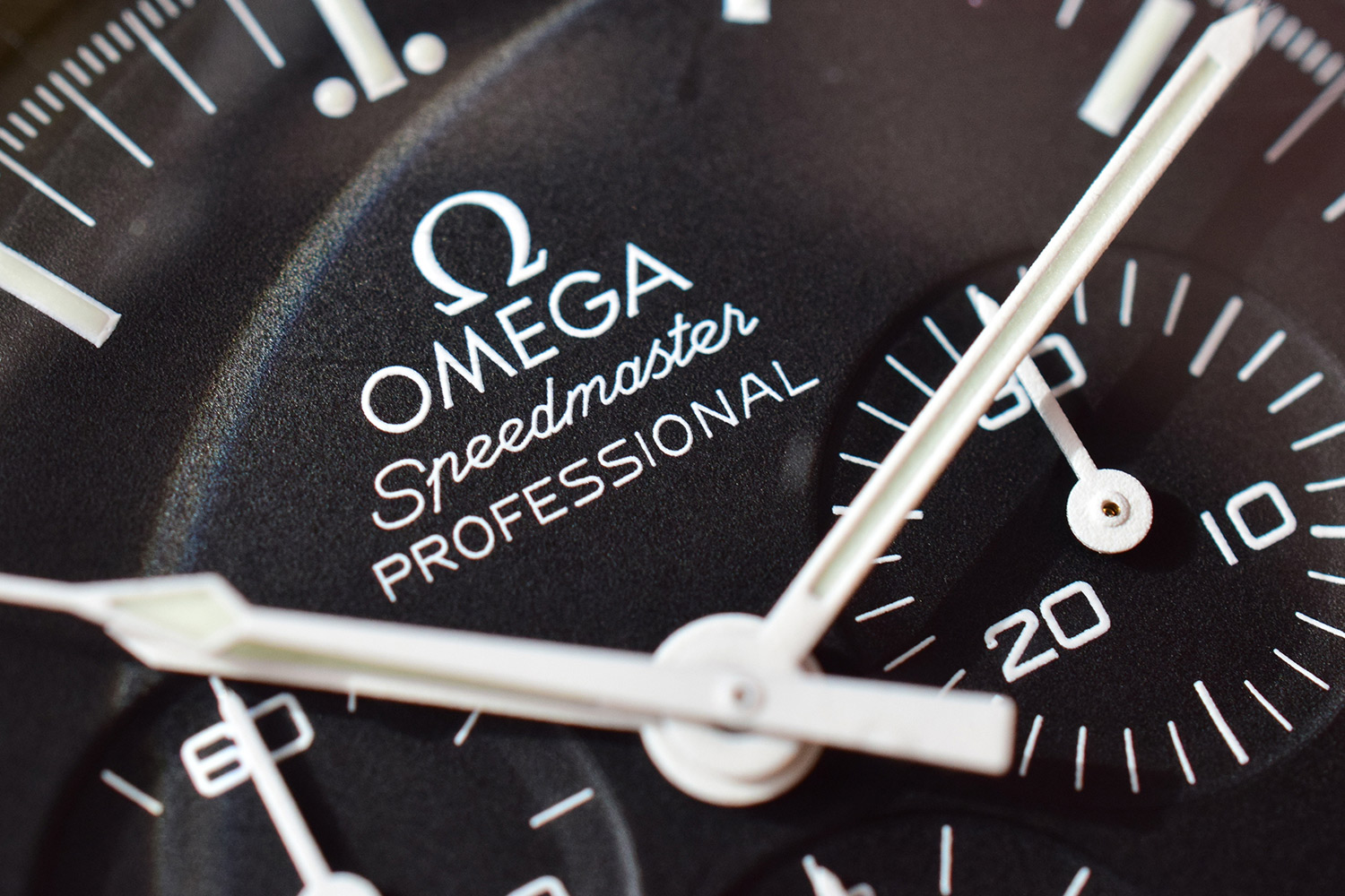
So, let’s kick of this new Macro focused column with the Omega Speedmaster Professional Ref 311.30.42.30.01.005. A watch with no see through back, yet plenty of details worth noting. Starting with the Speedmaster in low light, the dial looks plain, black with white painted markers. We will move closer and closer to see what details lie hidden in plain sight.

Tilting the watch slightly, the watchful eye will notice a little mark at the center of the Hesalite crystal…
![]()
Focusing on that point reveals the hidden Omega symbol engraved dead center. This is only seen in hesalite Speedmasters, not in the Sapphire models:

Adding a touch of light, we also start noticing a slight bend in the dial, which is not very visible to the eye, unlike the older speedmasters where this is still very noticeable. A much loved feature by the vintage watch enthusiasts among us:

Looking even closer, we now see the dial isn’t just a flat black. It has an impressive texture. In addition, the markers no longer appear plain white, and we see the strips of luminous material applied over the white markers:

Having a look at the subdials, at first sight, they look clean and almost plain:
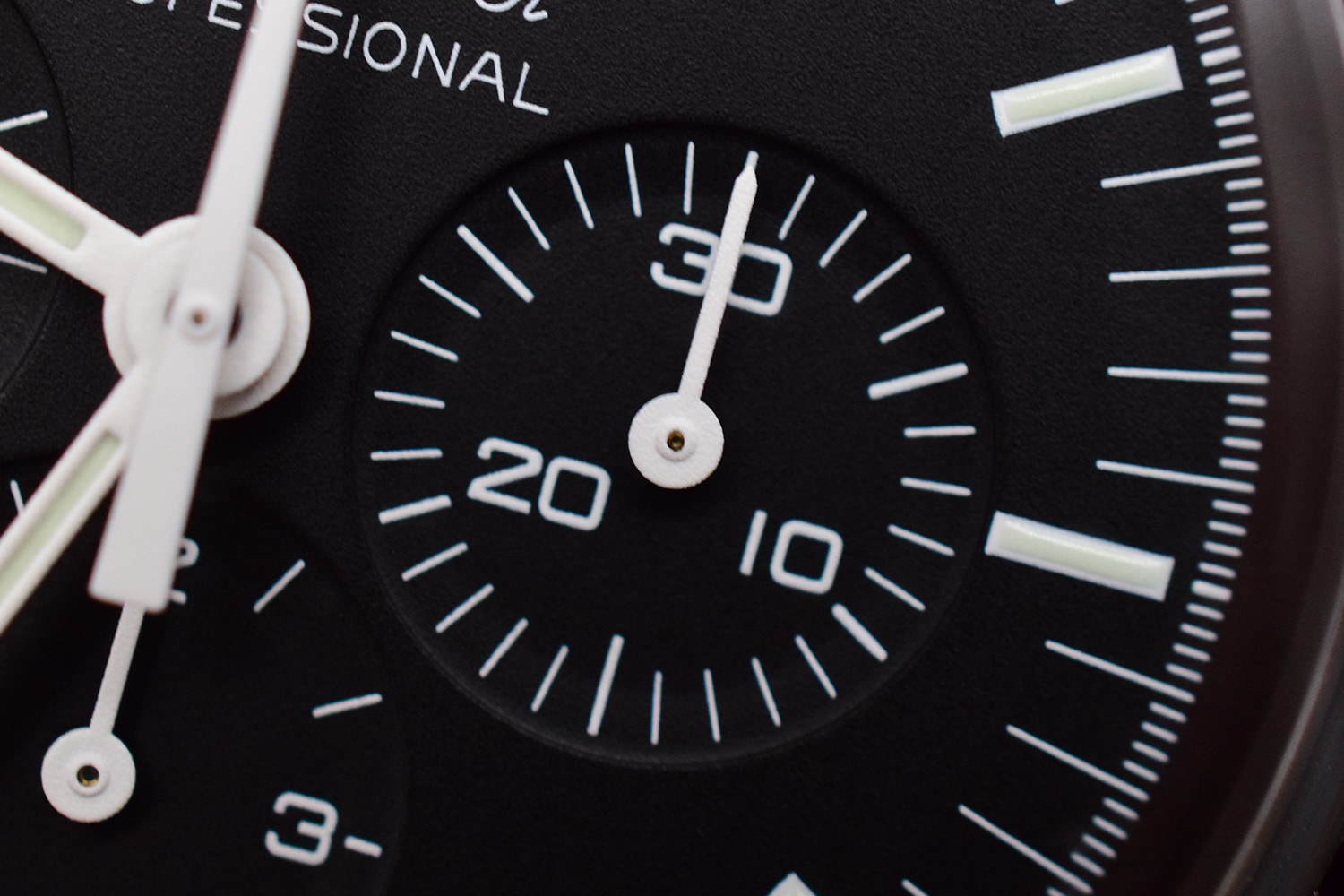
Looking with a slightly better lightsource we can see the appearance changing:

Looking even closer though, reveals a wonderful texture and a slight step in the subdials (much less pronounced than on the older models):

The Logo is a crispy clean white, no luminous overlay:
The hands reveal sculpted groves in which the luminous material shines bright:

Subtle reminder, Swiss Made:

The bezel looks perfectly fine to the eye, yet when zooming in, the years of being a daily beater definitely start to show:

The side of the case, with 5 years wear and tear on it, reveals both brushed & polished surfaces and the curves of the bezel:

Up close with a pusher:

Taking a brief stop to admire the overal case design:

Flipping the case over, we find ourselves facing an engraved back:

The Seahorse logo has a dotted type of texture:
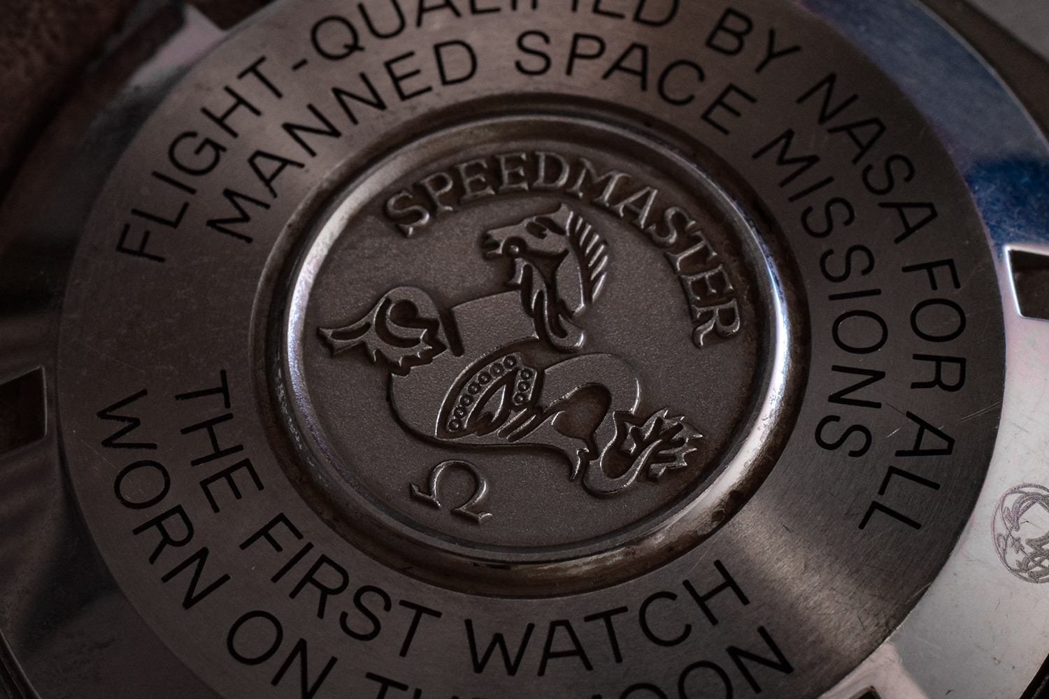
Whereas the outer section with the text engraving has a brushed surface:

And finally, a quick view of the anti-counterfeiting laser engraving:

That’s all folks! See you soon for another #Macromeister

Damn, I want to see more of these !
Great to hear Bart 🙂 There are more than a few lined up already! Very fun to shoot these. Next week another closed-back – the classic Reverso 😉
Awesome shots Sir! What is the name of the loupe you used? I been looking for one, you can totally email me! I’d love to see a close up of the Reverso myself too 😉
Thank you sir! It is a borrowed ‘Loupe System’, it’s pretty incredible stuff (pricetag reflects that…).